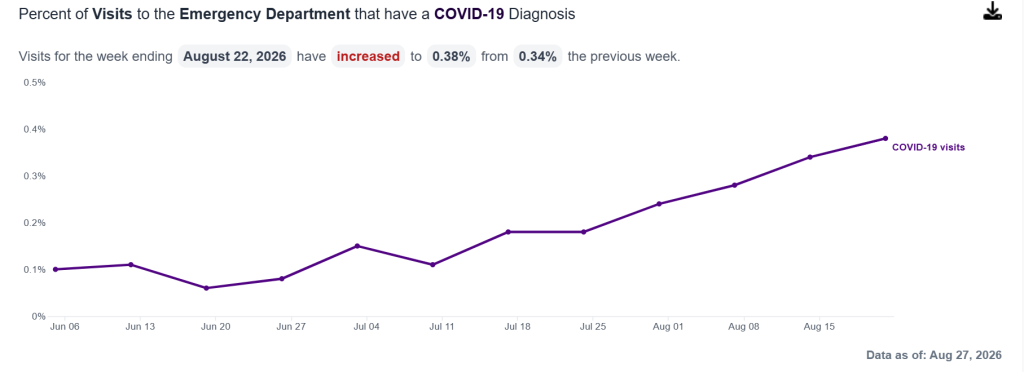
Chart from the New York City Department of Mental Hygiene Respiratory Illness Data pages
Over the past several years I’ve written about why I try to avoid spreading infectious diseases like COVID-19 and influenza. I don’t like getting sick, and I don’t like the risk of dying or being permanently disabled, but above and beyond that I’ve realized it’s one of the easiest ways to save lives. I don’t have to dive into an icy river or throw myself in front of a bullet. All I have to do is strap some paper over my face at certain times, and work from home, eat outdoors and do karaoke over zoom at other times? Sign me up!
One of the great things about protecting others from infectious diseases is that we don’t have to take these precautions all the time. Diseases like the flu have seasons – they almost always have a peak some time in mid-winter. COVID is less seasonal, but still comes in waves. That means we can go to concerts, sing karaoke, work in offices and eat indoors for most of the year.
The tricky part is knowing when to take precautions to avoid catching or passing on respiratory diseases, and when to stop. And this is what public health reporting should be able to help me with.
Public health agencies can’t tell me to care about whether my neighbors get sick, or how many deaths I should be prepared to tolerate. Those are my personal moral decisions. But they can tell me how many deaths we’ve tolerated in the past, and what are the most effective measures I can take to protect my neighbors. They can also tell me when is a good time to start being more careful, and when I can relax more.
I particularly liked the metric of hospitalizations per 100,000 residents used by the United States Centers for Disease Control and Prevention (until 2025), because it speaks directly to our goals: to minimize suffering from these diseases. Death rates are another good measure, but they’re a lagging indicator – we rarely know them soon enough to take action. Test positivity rates don’t tell us how severe the symptoms are. Case counts can vary depending on how many people make the effort to take a test and report it.
In May 2024 I set a personal threshold of 6 hospitalizations for COVID per 100,000 residents per day for when I would go into Outbreak Mode. That was based on historical data from the CDC’s RESP-NET showing that we tolerated about that many hospitalizations for the flu in December 2019. I’m sure we can do better, but it seemed like a good starting point.
The Department of Health and Mental Hygiene in New York City, my hometown, also reports hospitalization rates, but not per 100,000 residents, or as totals. You can get emergency room visits or admissions, but they are only available as percentages of total emergency room visits or admissions.
It’s understandable why the Department of Health and Mental Hygiene would want to track the percentage of emergency room visits and admissions due to COVID, the flu and RSV. I am also interested in that statistic. Remember in 2020 when we were trying to “flatten the curve”? The whole idea was to keep COVID care from overwhelming our hospitals and making them unavailable to people who needed care for car crashes, heart attacks and accidental poisonings.
But the point of open data is that the staff of the Department of Health and Mental Hygiene are not the only people who care about health statistics. Some of us care about other things, like the number of hospitalizations per 100,000 residents.
Part of basic numeracy is to be careful about your denominators. The Department of Health and Mental Hygiene is reporting COVID hospitalizations as a percentage of total hospitalizations. But the total number of hospitalizations is not constant.
Imagine that there is a COVID outbreak on the scale of those that we’ve seen in the past few years, but at the same time there is also an outbreak of an unrelated disease, possibly an intestinal infection. If the two diseases are both increasing, they could increase the total number of emergency room visits faster than the number of COVID visits. The percentage due to COVID will drop, even if the absolute number of visits due to COVID is actually increasing.
Under those circumstances, the average person will likely care about whether our hospitals are overwhelmed, but we will care much more about how likely we are to wind up in the emergency room for one of those diseases. The New York City Department of Health and Mental Hygiene should continue to report percentages of emergency department visits for COVID, influenza and RSV, but it should also release the total numbers, and ideally also the number of emergency department visits per 100,000 residents.
We know that the Department of Health and Mental Hygiene can report total COVID-related hospitalizations, because they did that from Spring 2020 right up to October 2025. At that point they expanded their open data to include the flu and RSV, which they had previously only reported as percentage graphs in a PDF. It’s great that we can now get data about the flu and RSV; all we need now are the totals for all three viruses!